Legend (Maps)
The Legend box enables you to compare data values for various regions and dimension items.
- The top part of the Legend box lists all the dimensions in the current report. You can use the left and right arrows to scroll through dimension items. The map colors will change to reflect the values for the current selections.
- The lower part of the Legend box shows the range of data values for the current view. The number on the right, in brackets, indicates the exact count of values that fall within the given range.

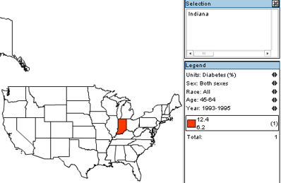
For example, the above screenshot shows the legend for a thematic map representing data for Indiana. The current item selections for each dimension are:
- Units - Percentage of population which has diabetes.
- Sex - Both sexes.
- Race - All races.
- Age - 45 - 64.
- Year - Years from 1993 - 1995.
We can see that in Indiana, the number of people who fit all the criteria (both sexes, all races, age 45-64, etc.), and who have diabetes, is between 6.2 and 12.4 percent. Hovering over Indiana with the mouse cursor reveals that the exact figure is 6.2%.
- To change the criteria, we can use the left and right arrows in the upper part of the Legend box. For example, clicking the right arrow on the Race dimension shows that the incidence of diabetes in Indiana for citizens who fit all the criteria, and whose race is classified as "White," is lower than that for "All races."
